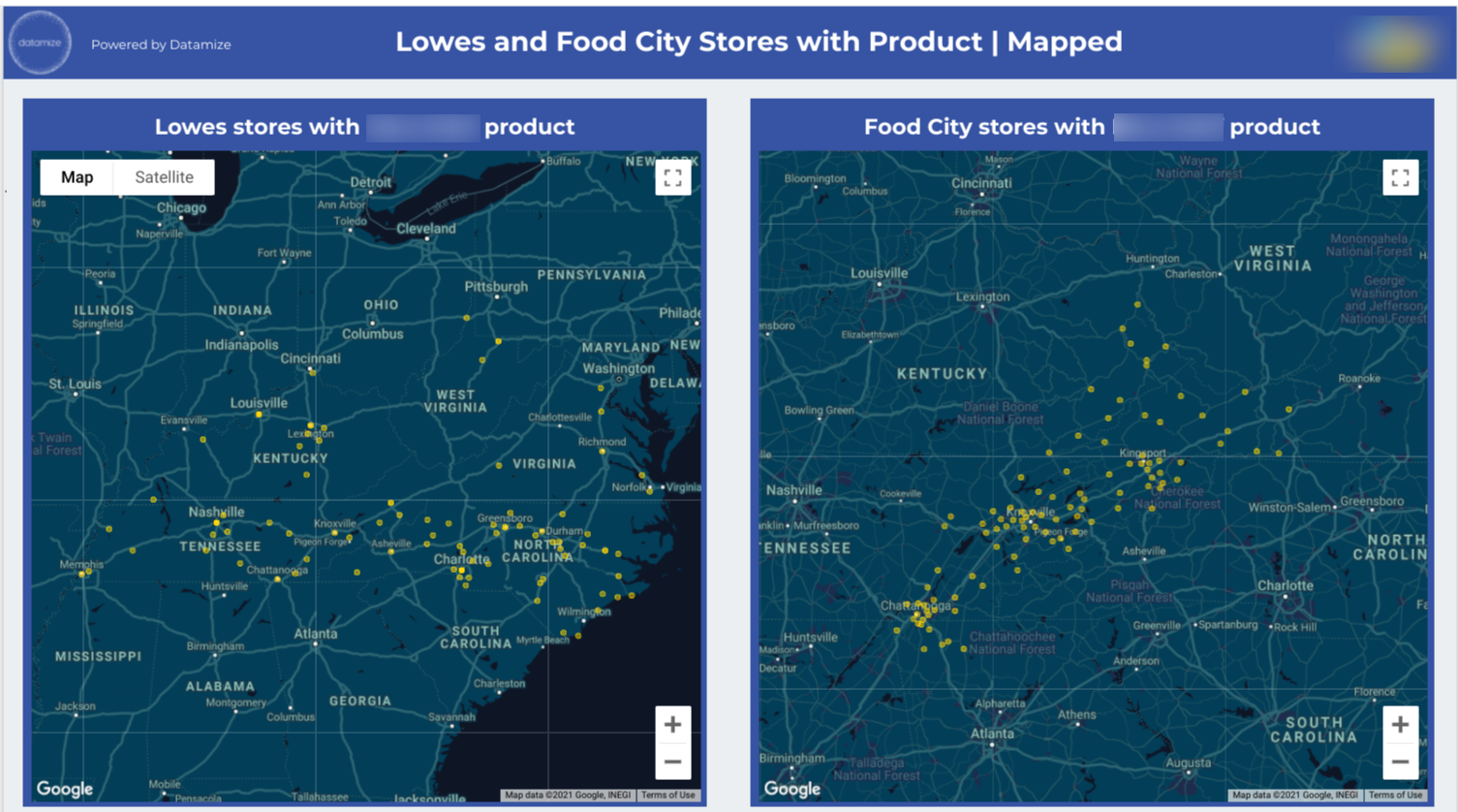
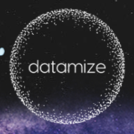
For our CPG brand client, we took data from spreadsheets and mapped and visualized it to understand the densest clusters of stores with products at a point in time. Then combined the geographies with a model to target marketing campaigns and support sales outreach, which increased revenue.
If you’re not a data scientist (and sometimes even if you are), big data can be daunting.
Plowing through numbers is taxing and time-consuming. It’s easy to lose your way. You might battle through ‘figures fatigue’ and find useful points and patterns, only to find yourself struggling to communicate them to a wider team. And if you’re dealing with data points in the thousands or millions, it’s simply impossible to process them in numerical format alone.
Data visualization is one of those things that just makes corporate life easier. And it comes down to a simple fact (on which the data is undeniable): our brains prefer pictures.
For our CPG brand client, we took data from spreadsheets and mapped and visualized it to understand the densest clusters of stores with products at a point in time. Then combined the geographies with a model to target marketing campaigns and support sales outreach, which increased revenue.
Why should I use data visualization?
- To communicate insights easily. Nothing incites a mental switch-off like numbers. Some of us experience ‘math anxiety' well into our adult lives. Data visualization converts dull digits into clear, attractive, interactive imagery that you can present, brand, and customize. It allows you to choose the types of charts that resonate the most strongly with you and your team. And it builds trust and understanding among staff, clients, shareholders, board members, and investors.
- To boost your revenue. Data visualization can reveal weak links (like low-revenue products or unnecessary expenses) and unrealized potential (like new markets and untapped demographics). It can signal a need to reposition, illuminate what’s working and what’s not, and help you understand and replicate previous successes.
- To have a positive social impact. Many socially-led organizations and nonprofits are reaping the benefits of data visualization. When it comes to charity, fighting for causes, inciting behavioral change, and getting people to listen, data on how people are responding is not just helpful - it’s indispensable.
- To strengthen trust and communication within your team. As humans, we’re prone to biased views on why a project might have gone badly, why sales are down, and even less helpfully, who’s to blame. Sales might blame marketing and vice versa. Comms teams might clash with C-suite execs. Data visualization cuts through the noise to present simple facts. Removing bias and emotion from workplace debates saves time and facilitates healthy, efficient resolutions.
What data visualization tools should I be using?
There are several good data visualization tools you can use to create intelligent views of your data so you can make revenue-boosting actions.
- Tableau is the biggest data visualization platform on the market. It’s integrated with MySQL, Amazon AWS, Hadoop, and Teradata.
- Qlik has a ‘brother and sister’ offering: Qlikview and Qliksense.
Qlikview is an ‘in-the-box’ tool, offering ready-made models and charts for presenting insights. Qliksense is geared towards exploration and discovering, allowing you to build your own applications and visualizations. Qliksense is so customizable, and the features offered are so broad, you’ll need to be fairly well-versed in data science to get the most out of it (or hire a data strategist to capitalize on it). - Perhaps the best thing about Sisense is its drag-and-drop interface. Drop all of your data into a singular ‘repository’ where you can use multiple tools or ‘dashboards’ to query it. You can build custom dashboards for different departments or team members. Even the less ‘techie’ among us will find them easy to interpret.
- Microsoft PowerBI is another powerful platform and is conveniently compatible for those using the MS Suite. Note: even Microsoft Excel includes small-time data visualization tools. Naturally, this comes with the caveat of being well-versed in Excel, something paid, dedicated software doesn’t require.
- Google Data Studio comes with the major advantage of being totally free. It’s suitable for all user levels and provides tutorials for beginners. However, some organizations dealing with huge quantities of data might find it restrictive.
What do I do with the data once I’ve visualized it?
Although data visualization makes interpreting your numbers substantially easier, there are still decisions to be made once you have a clear picture.
We couldn’t put it better than the Harvard Business Review did in 2016: ‘Automatically converting spreadsheet cells into a chart only visualizes pieces of a spreadsheet; it doesn’t capture an idea.’
This is where the harvesting stops, and the strategy starts. Ask yourself, does this data present a final answer? A non-negotiable solution? Or does it require further drilling down?
Data will tell you that you need to change your strategy, but it won’t tell you how. This is where data strategists come in.
See how data can boost your revenue by booking a free 15-minute meeting with a Datamize Strategist today. We can help you to unlock valuable information from your data, and get tailored, expert assistance with the crucial next steps.
 and then